Burn Down Chart. Oversee Sprints with the Remaining Workload.
What advantages does a burn down chart offer and how can you create burn down charts?
The burn down chart is a means of control for sprints in agile projects (e.g. Scrum projects). It visualizes the work that still needs to be done in relation to the time and provides information as to whether the goal is achievable. Based on the course of the line you can also determine whether the development is over or under-strained.
An ideal course of the remaining effort is, in practice, never seen. Instead, the line fluctuates. If you are way above the idea, then it could mean that there are too many requirements planned in the sprint.
If the line of the remaining effort is underneath the ideal line, then the developers are working very quickly and might be underwhelmed by the workload.
What Is a Burn Down Chart?
How much work is still in your current sprint? Are you on schedule or working too slowly? These are questions you will encounter often in Scrum projects. To answer these questions, the burn down chart has proven itself: it visualizes how much work still has to be done at the current point in time. Apart from that, the diagram reveals how quickly the team is working. Based on this, you can, for example, determine whether the developers have received too many or too few tasks to edit and include this information in the next planning phase. The burn down chart is recommended to control iterations or sprints. Because there, the scope – that means the number of requirements to be implemented – is fixed in a defined time frame.
Advantages of the Burn Down Chart
- Simple, comprehensible aid for sprint controlling
- Quick overview of the work that still has to be done in an iteration
- Realistic statements because they are cultivated daily by the development team
- Indicators as to whether the development team is on schedule
- Indicators for the speed and estimation ability of the team
- Means of recognizing risks through daily updates
- Means of communication with the customers and stakeholders
Short definition of a burn down chart:
The burn down chart is a means of control for sprints in agile projects (for example, Scrum projects). It visualizes the work that still needs to be done on a particular day, and lets you know whether or not the work will be done.
How Do You Create a Burn Down Chart?
The burn down chart depends on tasks and on the developers, who have to estimate a remaining workload for their implementation every day. That is why you have to break down your user stories into tasks as the first step and estimate your workloads.
For the next step, generate the diagram. A burn down chart always consists of an x axis with the time and a y axis with the remaining workload. Because the remaining workload for the tasks is collected every day, you can see a measurement in days on the x axis. For the remaining workload, an entry in story points or hours is recommended.
In the simplest form, the burn down chart just shows you a curve for the daily collected remaining workload. To visualize the optimal course of the sprint, a second linear curve is often drawn.
Because the remaining workload tracks the sprint, the curve doesn’t start at 0, but at the value of the total workload at the beginning of the iteration, for example, 50 hours. You then enter the remaining workload for the tasks every day. At the end of the sprint, the remaining workload should reach the value 0 – the requirements will be implemented. That is why the diagram gets lower over the course of the project and shows, at the same time, how much work still has to be “burned down”.
Prerequisites for a Burn Down Chart
The size and the degree of detail of the tasks has to be measured:
The scope of the tasks should not be too large so that developers can realistically estimate the remaining workload. That is why the user stories must be broken down into a recommended amount of tasks. In large Scrum projects this leads to a large number of requirements that have to be managed. To manage these challenges, it is best to implement software.
The remaining workload is not the already rendered workload:
You have to estimate the remaining workload of a task every day. If you, for example, determine on Wednesday that the workload is indeed larger than you thought it was on Monday, then enter the larger workload. The amount of effort you have already spent doesn’t matter for the estimation of the remaining workload in the burn down chart.
The remaining workload has to be recorded every day:
The burn down chart requires the developers to estimate their remaining workload every day at the end of the work day. Accordingly, this task has to be pursued diligently so that the burn down chart reflects the current state in the sprint.
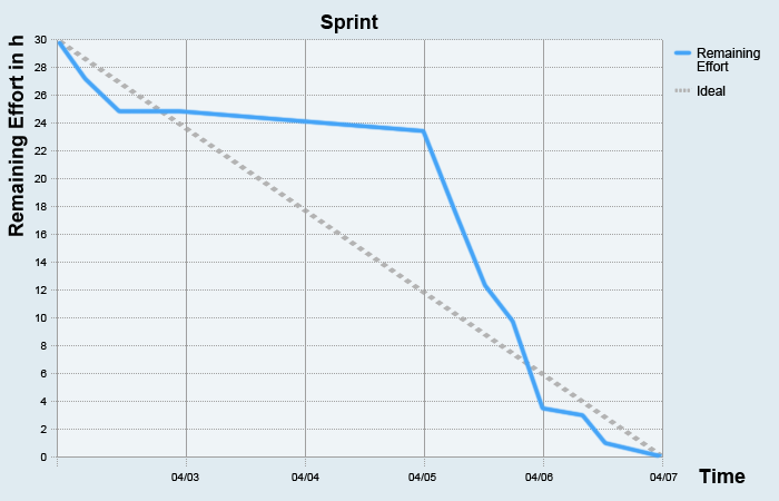
Example of a Burn Down Chart

In this example, you can see that
- the sprint has a duration of five days (see the x axis with the date)
- and the effort of the tasks at the beginning of the sprint is thirty hours.
The ideal workload is the grey linear curve. The blue line is the remaining workload. What can you read from this burn down chart?
On day one the remaining workload is still 30 days. The developers have most probably worked on their tasks, but estimate at the end of the work day that they will still have just as much work to do as they did this morning.
On day two, the remaining effort will be estimated more tightly. You can see how the remaining workload still consists of 27.5 hours.
On the third day the developers give a positive prognosis: the remaining workload has fallen by ten hours, to 17.5 hours.
But what happened on days four and five? Suddenly, it looks like a standstill, as if no one has been working any more. Is that the actual case or are there other reasons? Like in a cumulative flow diagram, there can be different reasons for this development – and you have to suss them out.
How to work with Burn Down Charts in Practice
Interpretations of the Burn Down Chart
When you interpret a burn down chart, the first rule is: there is never an ideal line for the remaining workload. Period. If you see such a development, you should question the reliability of this diagram. It probably runs according to the motto: I will enter what is expected and not what corresponds to reality. Apart from this (hopefully) non-occurring case, there are other options for the development of the curve from which conclusions can be drawn. For example:
Case 1: The team could not implement all the tasks in the sprint
The remaining workload at the end of the sprint doesn’t come to 0: the developers couldn’t implement all the requirements in the sprint. The reasons for such a development can vary: for example, the developers might just be working too slowly, or they were overwhelmed with the number of tasks in the sprint. You have to find out the cause so that you can plan the next sprints better.
Case 2: The teams hurries to implement all the tasks at the end of the sprint
The curves of the remaining effort sank for a while only a little bit or even horizontally and then suddenly it fell down and reached a remaining workload of 0. At the end of the sprint, the developers have worked flat out to implement all the requirements. But why was the work so sluggish at first? Were the developers underwhelmed and put off the tasks until they had to hurry them all? The case here can also be that the tasks were assessed too broadly and so the progress was difficult to track. You should follow up these questions.
Burn Down Chart vs. Burn Up Chart
The burn down chart is recommended for a fixed scope of requirements. If you want to use the diagram for the whole project with sprints and releases, it has its limits. For example, you see a straight line or even an increasing line for the remaining effort. In these cases there can be another reason for this development: new requirements have been added – so the scope has changed. This is not impossible in the everyday of a Scrum project. Because the amount of requirements in the course of an agile project is always changing and the burn down diagram doesn’t consider this distance, other diagrams are recommended as controlling tools for the whole project, like the burn up chart or the cumulative flow diagram.
Oversee your sprints
If you are agile and work with timeboxing à la Scrum, then you always have to know how your current sprint is going. But your stakeholders also have a burning interest. With a burn down chart, you can quickly record how much work still needs to be done and whether the goal of the sprint can be reached. Because the remaining effort of the tasks is recorded daily, you can also recognize at a glance if the sprint is endangered. But do you want to draw the diagram by hand? Or use one tool for planning your sprints and another to visualize them as burn down charts? Use a software that offers you a template for Scrum projects, with which you can create sprints, user stories and tasks and make evaluations, for example, through burn down charts.