Burn Up Chart. Project Controlling with Finished Requirements.
What does a burn pp chart show? What advantages does it offer and what is it recommended for?
The burn up chart is an easy-to-understand means of controlling your project and shows you how much work has to be completed in relation to time and how much there is to do overall.
Unlike with the burn down chart, the burn up chart considers changes to the scope. For example, some requirements have been added here.
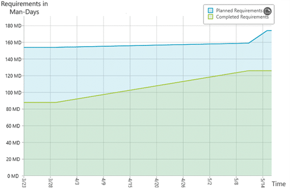
The burn up chart visualizes a curve for the planned project progress and for the current project progress. The current-state curve gets closer to the planned-state curve over the course of the project until the two lines meet: the requirements have been implemented.
What is a Burn Up Chart?
The burn up chart is a line diagram or a plane diagram that shows you how much work has already been finished and how much still needs to be done. Because the presentation includes the changeability of the scope, the burn up chart is recommended for controlling an entire project, for example, a Scrum project. Because, as you know from agile project management: the goals and desires of the stakeholders change over the course of the project and requirements have to be adapted. The burn up chart considers this circumstance. If you only want to oversee individual sprints with fixed scopes, then you can also use the simpler variant, the burn down chart.
Advantages of a Burn Up Chart
- Easy-to-understand aid for project controlling
- Enables you to make a prognosis about the continued course of the project as well as its conclusion
- Quick overview of the work that’s been done
- Inclusion of changes to the scope of the project
- Indicators as to whether the project is on schedule
- Means of communicating with customers and with stakeholders
How to work with Burn Up Charts in Practice.
Test objectiF RPM 30 days free of charge »
Short and sweet definition of a burn up chart:
The burn up chart is an easy-to-understand means of project controlling (for example, for Scrum projects). The diagram shows how much work has been done in relation to time and how much is left to do overall.
How Do You Create Burn Up Charts?
The burn up chart shows you the finished and planned requirements over a span of time. As the first step, you have to precisely define: when are the requirements finished (definition of done)? Only when it is clear to every project participant and also every stakeholder that finished requirements, for example, have always been tested and accepted, can the burn up chart be correctly understood.
As the next step, produce the diagram. Similar to the burn down chart, the burn up chart always consists of a x axis with the time and a y axis with the requirements. The requirements can, for example, be measured in story points or person-days.
So, in the burn up chart, you can see two curves: one for the planned requirements and one for the finished requirements. The planned requirements line is the project goal and it should approach the curve for the current requirements over the project course, until both lines meet at the end: the requirements have been implemented. That is why the diagram gets higher and shows at the same time how much work has been “burned”. Based on the current progress, you can also make a prognosis as to when the project will be finished.


Burn Up Chart vs. Cumulative Flow Diagram
In a nutshell, you can compare finished requirements with planned ones in a burn up chart and get a prognosis as to when the project will be finished. But what if you want to check more than just the finished requirements? What if you, for example, would like to examine how many requirements are being tested at the moment? Or if you want to more precisely identify the places where there might be problems? For these purposes, the cumulative flow diagram is recommended. It visualizes the distribution of the requirements into their different states like in realization and in testing over a time span. This way you can see more than two curves and can, for example, find out that many requirements are being edited but very few have been tested. That creates a solid foundation to find the cause of problems in a project on the ground. In this sense, the cumulative flow diagram forms the next step for your project controlling after the burn up chart.
Read here to find out more about the cumulative flow diagram »
Survey your projects with the burn up chart
The burn up chart is the next level after the burn down chart and at the same time a simplified cumulative flow diagram. Because with the help of the diagram you can not just watch individual sprints, but your entire project. The reduced presentation is simple to understand with the two curves for the planned and current and is best recommended to convey to yourself, but also to the stakeholders, a first glance of the current project status. With software, such a chart can be created easily based on your project data. Because you can not only plan your agile projects and requirements but also produce evaluations like burn up charts directly in the tool with just a few clicks.